
You don’t need more engineering metrics.
You need better questions around the ones you already have.
I learned this the annoying way...
A few years ago I was looking at engineering activity across a large product suite.
Multiple teams.
Multiple applications.
Multiple managers.
Multiple dashboards.
And a lot of green numbers.
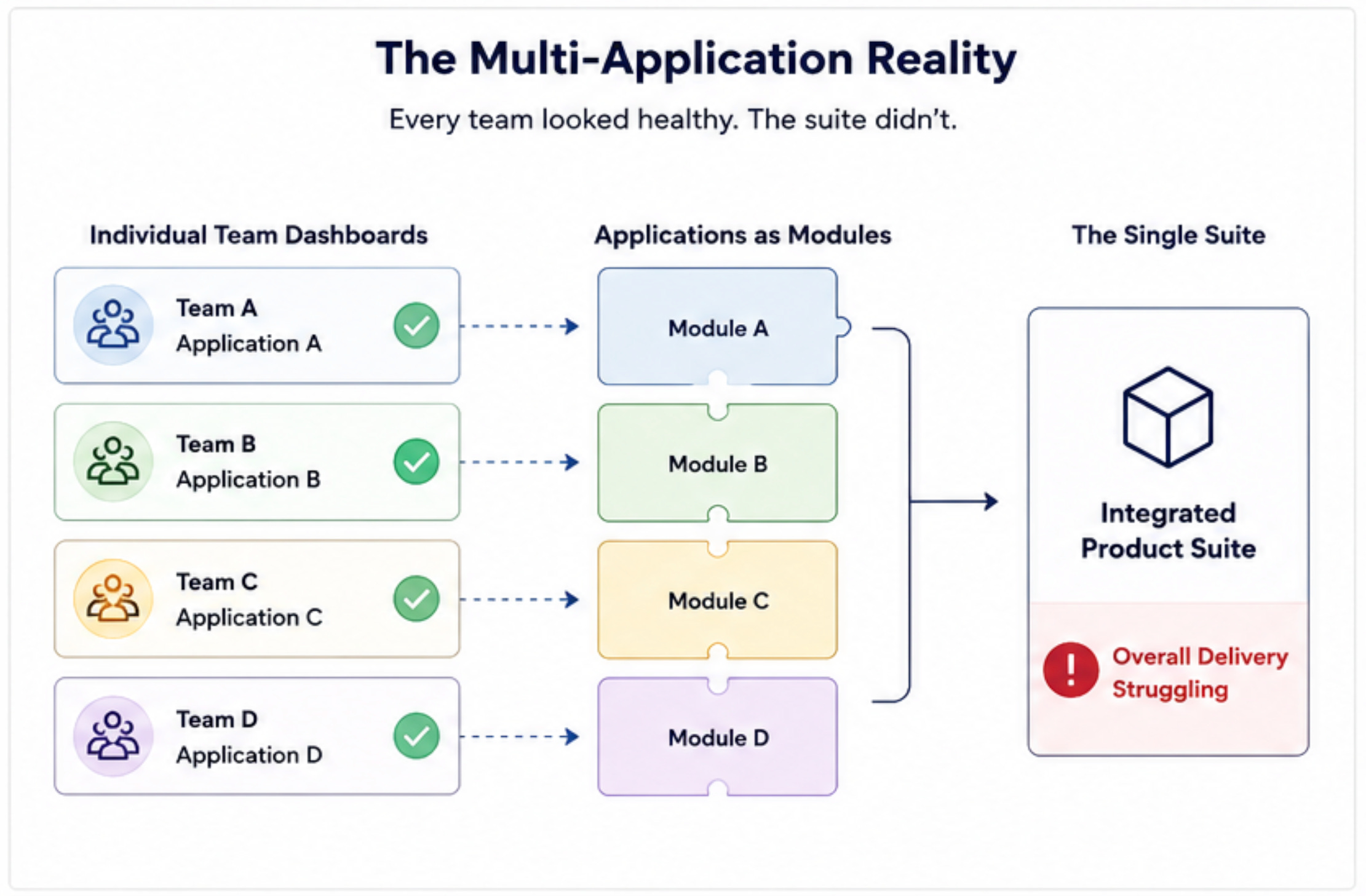
Every team can be green while the system is struggling.
Team A looked healthy.
Team B looked healthy.
Team C looked healthy.
Team D looked healthy.
Everyone seemed busy.
Deployments were happening.
Pull requests were moving.
Sprint goals were being hit.
The dashboards looked good.
But the product suite was still struggling.
Customers were feeling friction.
Teams were waiting on other teams.
Small changes took longer than expected.
Some releases created problems somewhere else.
And nobody could point to one metric and say:
“There. That’s the problem.”
That was the moment I started looking at engineering metrics differently.
The numbers weren’t necessarily wrong.
The story we were telling ourselves about those numbers was wrong.
And that’s a much more dangerous problem.
When the number becomes the goal
This happens more often than we like to admit.
We choose a metric because we want to improve something.
Then we start managing the metric.
Then...
without noticing it...
the metric becomes the goal.
Story points are a good example.
A team completes more story points this quarter.
Everyone celebrates.
But did the product get better?
Maybe.
Maybe not.
The team could have broken work into smaller pieces.
They could have estimated differently.
They could have optimized for points instead of customer value.
The number went up.
The outcome might not have.
The same thing happens with deployment frequency.
More deployments can be great.
But more deployments can also mean more tiny changes.
Or more risky changes.
Or more rollbacks.
Or more production noise.
Cycle time can fall while teams simply push easier work through the system.
PR volume can rise while the real work gets harder.
This is basically the trap behind Goodhart’s Law:
When a measure becomes a target it can stop being a good measure.
People aren’t stupid.
They respond to incentives.
If I tell you I’m measuring something...and then judge you based on it...you’re probably gonna optimize for it.
That’s not gaming the system.
Sometimes it’s just rational behavior.
Four levels of Productivity
One reason engineering metrics get confusing is because we measure different things as if they’re the same thing.
I find it useful to think about four levels.
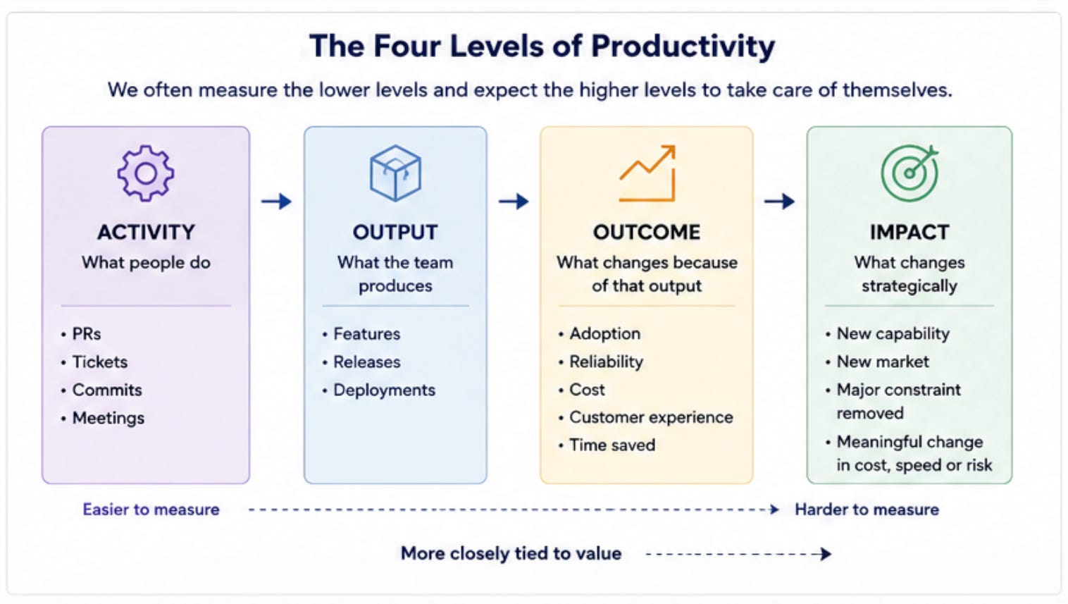
4 levels of Productivity: Activity → Output → Outcome → Impact
This is where the conversation gets interesting.
Most engineering dashboards are strongest at the bottom.
Activity is easy to count.
Output is fairly easy to count.
Outcome is harder.
Impact is harder still.
So we end up with dashboards full of numbers because numbers are convenient...not necessarily because they’re useful.
The most dangerous metric is the one that looks reasonable
Bad metrics are easy to ignore.
If I show you a completely ridiculous metric you probably won’t trust it.
The dangerous ones are different.
They look sensible.
Deployment frequency.
Cycle time.
Lead time.
PR throughput.
Defect rate.
Change failure rate.
None of these are bad metrics.
That’s important.
The problem isn’t the metric.
The problem is believing the metric explains more than it actually does.
Imagine deployment frequency drops.
What happened?
Maybe the team slowed down.
Maybe a release process changed.
Maybe the team spent two weeks fixing a major production issue.
Maybe another team became a dependency.
Maybe the product was stable enough to need fewer deployments.
The metric tells you something moved.
It doesn’t tell you why.
And that’s the part we often skip.
We see the graph.
We tell ourselves a story.
Then we act as if the story was a fact.
Your team might not be the problem
This is where things get uncomfortable.
Sometimes a team looks slow because the system around the team is slow.
Think about everything between writing code and delivering value:
Architecture.
Approvals.
Testing.
Environments.
Security reviews.
Release processes.
Dependencies.
Legacy systems.
Shared services.
Handoffs.
Ownership boundaries.
External vendors.
Other teams.
A team can improve every metric inside its boundary...
and still make very little progress at the system level.
I’ve seen this happen.
One team optimizes its workflow.
Another team does the same.
A third team does the same.
Everyone gets locally better.
The overall product still feels slow.
Why?
Because local optimization doesn’t guarantee system improvement.
So instead of only asking:
“How productive is Team A?”
sometimes the better question is:
“What is slowing the system down?”
That’s a very different conversation.
And usually a much more useful one.
The Watermelon Effect
There’s a name for another version of this problem.
The Watermelon Effect.

Everything looks green on the outside.
But it’s red on the inside.
Imagine an IT dashboard showing green across the board.
SLAs are being met.
Servers are up.
Technology metrics look healthy.
The reports say everything is fine.
Then you talk to the people actually using the systems.
And you hear something very different.
“It’s slow.”
“I have to work around it.”
“This process wastes my time.”
“I still can’t get my work done.”
Now we have a problem.
The dashboard says green.
The experience says red.
That’s the Watermelon Effect.
Green outside. Red inside.
The metrics aren’t necessarily wrong.
They’re measuring only part of reality.
And this matters far beyond IT.
The same thing can happen inside engineering.
A team can hit its delivery target while developers are drowning in interruptions.
A platform can meet its uptime target while users struggle with poor performance.
A service can meet its SLA while employees spend hours finding workarounds.
The Watermelon Effect isn’t really a story about bad dashboards.
It’s a story about incomplete truth.
We’re looking at the outside.
Users and employees are experiencing the inside.
And the gap between those two things is where a lot of engineering problems hide.
Measure the experience too
This changed how I think about engineering productivity.
We usually talk about:
Activity → Output → Outcome → Impact
But there’s another dimension running through all four.
Experience.
People don’t experience your deployment frequency.
They experience whether the product works.
They don’t experience your uptime percentage.
They experience whether they can get their work done.
They don’t care how healthy your engineering dashboard looks if the product feels painful.
So I like thinking about this as:
Metric → Experience → Outcome → Impact
The metric is the signal.
The experience tells us what it feels like in the real world.
The outcome tells us what changed.
The impact tells us why it matters.
If those layers agree...
great.
If they don’t...
don’t hide the disagreement.
Investigate it.
That disagreement might be where the real problem is.
Should we stop measuring engineering?
No.
Please don’t throw away your dashboards because I wrote an article about dashboards.
I’ve made enough mistakes without adding that one to the list.
Metrics are useful.
They help us see trends.
They help us spot changes.
They help us compare periods.
They help us ask better questions.
The problem starts when we confuse measurement with understanding.
A metric is evidence.
It’s not an explanation.
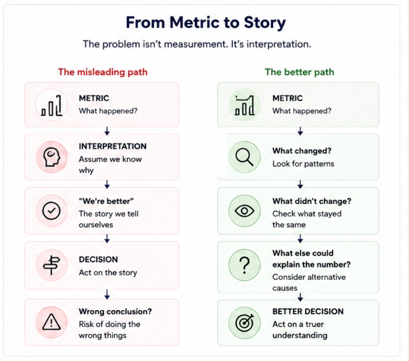
So the question isn’t:
“Is this metric good?”
A better question is:
“What became better because this number moved?”
If you can’t answer that...
you probably need to investigate before celebrating.
The Engineering Metrics Truth Audit
Here’s the simple audit I use to challenge the story behind a metric.
Take any important engineering metric.
Then ask five questions.
1. What are we actually trying to improve?
Be specific.
Not “developer productivity.”
That’s too vague.
Maybe it’s:
“Reduce the time it takes customers to complete checkout.”
Now we have something real.
2. What does this metric tell us about that?
Suppose the metric is deployment frequency.
Does more frequent deployment directly tell us checkout is improving?
Probably not.
It may be related.
But related isn’t the same as proven.
3. How could we improve the metric without improving the outcome?
This is my favorite question.
Because it forces you to attack your own metric.
Could deployment frequency increase without customers getting more value?
Yes.
Could PR volume increase without productivity improving?
Absolutely.
Could story points increase without delivering more value?
Of course.
If the answer is yes...
you’ve found a blind spot.
4. What important thing does the metric leave out?
Every metric leaves something out.
That’s normal.
The mistake is pretending it doesn’t.
Maybe your cycle-time metric ignores waiting for approval.
Maybe your defect metric ignores customer frustration.
Maybe your uptime metric ignores usability.
Maybe your delivery metric ignores business impact.
Ask what’s missing.
5. What decision will we make when the number changes?
This question is brutally practical.
If deployment frequency falls...
what will you do?
If cycle time rises...
what will you do?
If PR volume doubles...
what will you do?
If you don’t know what decision the metric should trigger...
why is it on the dashboard?
Build a better engineering dashboard
I like making this painfully simple.
For every important metric write down five things.
MetricWhat it tells usWhat it doesn’tWhat else could explain it?DecisionDeployment frequencyHow often changes are deployedWhether releases create valueSmaller changes, automation, release policyInvestigate changeCycle timeHow long work takes through the flowWhy work waitsReviews, dependencies, queues, environment issuesFind bottleneckPR volumeAmount of PR activityBusiness valueSmaller PRs, workflow changesCheck contextDefect rateNumber of reported defectsTotal user painReporting behavior, severity, exposureLook at impact
The last two columns are where the magic happens.
What else could explain it?
That’s where you challenge the story.
Decision
That’s where measurement becomes useful.
A dashboard shouldn’t just tell you what happened.
It should help you decide what to investigate next.
KEEP. CHANGE. REMOVE.
Once you’ve audited your metrics you don’t need to keep everything.
I use three simple buckets.
KEEP
The metric is useful.
It connects reasonably well to the thing you’re trying to improve.
Keep it.
But still question it.
No metric gets a lifetime membership card.
CHANGE
The metric contains useful information...
but it’s incomplete.
Maybe it needs another metric beside it.
Maybe you need an experience signal.
Maybe you need to segment it by product area.
Maybe you need to change the way it’s interpreted.
Don’t throw it away.
Improve it.
REMOVE
The metric creates more confusion than value.
Maybe nobody knows what decision it supports.
Maybe people optimize for the number instead of the outcome.
Maybe it has become a vanity metric.
Remove it.
Yes...
even if you’ve been reporting it for three years.
Sunk cost isn’t a measurement strategy.
Look beyond the team boundary
Here’s another test I like.
When a metric moves...
look one level outside the team.
Then another.
A team’s cycle time might be high because reviews are slow.
Reviews might be slow because another team owns a dependency.
That dependency might be slow because the architecture creates a bottleneck.
The architecture might exist because of an old product decision.
Suddenly your “team productivity problem” isn’t really a team productivity problem.
It’s a system problem.
This is why engineering metrics need context.
The closer you get to the real constraint the less useful a single-team metric becomes.
Talk to the people experiencing the system
This is the easiest way to look for the red inside the watermelon.
Talk to the people using the product.
Ask:
What’s getting in your way?
What’s slower than it should be?
What wastes your time?
What works technically but feels painful?
You don’t need a giant survey.
You need honest signals.
The dashboard might say:
99.9% uptime.
The user might say:
“I still can’t get my work done.”
Both can be true.
That’s why experience belongs beside your engineering metrics.
Not instead of them.
Beside them.
The five-minute metric audit
You don’t need a three-month transformation project.
Pick one metric.
Just one.
Then write:
Metric:
What number are we looking at?
Intent:
What are we actually trying to improve?
Signal:
What does the metric tell us?
Blind spot:
What does it leave out?
Alternative explanations:
What else could cause the number to move?
Experience:
What are users or employees experiencing?
Outcome:
What changed in the real world?
Decision:
What should we do if the number moves?
Action:
KEEP / CHANGE / REMOVE
Five minutes.
That’s enough to expose a surprising amount of nonsense.
Your dashboard isn’t the strategy
I’ve sat in enough meetings to know how this goes.
Someone shares the dashboard.
The lines move.
Someone asks why.
Another person gives an explanation.
Everyone nods.
Then we move to the next slide.
The dangerous part isn’t the dashboard.
It’s the confidence we place in the story around it.
A metric can be accurate.
A dashboard can be technically perfect.
The data can be clean.
The calculations can be correct.
And you can still make the wrong decision.
Because accuracy isn’t the same as meaning.
Your deployment frequency can be accurate.
Your cycle time can be accurate.
Your PR count can be accurate.
Your uptime can be accurate.
The question is...
What do those numbers actually tell you?
And what are you assuming they tell you?
That’s where engineering leaders need to slow down.
Not because metrics are bad.
Because metrics are powerful enough to make weak stories look convincing.
The real goal isn’t more measurement
I used to think better engineering management meant getting better data.
Now I think it means getting better questions.
The goal isn’t to build the biggest dashboard.
It’s to build a dashboard that helps you see reality.
Sometimes that means adding a metric.
Sometimes it means removing one.
Sometimes it means talking to users.
Sometimes it means looking across team boundaries.
Sometimes it means admitting the number you celebrated last quarter didn’t mean what you thought it meant.
That’s not failure.
That’s learning.
And honestly...
I’d rather discover a bad story than keep making good-looking decisions based on it.
Final takeaway
A green metric next to a red experience isn’t a contradiction.
It’s a signal.
Something is missing.
That’s what a good metrics audit is designed to find.
Take the five metrics you trust most.
Try to break them.
Find their blind spots.
Talk to the people experiencing the system.
Look for the friction between teams.
Ask what outcome actually changed.
Then decide what to keep what to change and what to remove.
Keep the metrics. Question the story.
Because the dashboard isn’t the strategy.
The questions you ask about it are.
Want the playbook?
If this article made you look at your engineering dashboard a little differently...
I put the practical version into an Engineering Metrics Truth Audit Playbook.
It gives you a simple way to:
audit the metrics you already use
find misleading or incomplete metrics
spot the blind spots in your dashboard
connect engineering activity to real outcomes
uncover the Watermelon Effect
bring employee and user experience into the picture
find system-level constraints
decide what to keep, change or remove
turn metrics into better engineering decisions
No giant framework.
No 47-page consulting report.
Just a practical playbook you can use with your team.
If you want to stop collecting numbers and start getting better decisions from them... Get the playbook.
Because you don’t need more engineering metrics.
You need better questions around the ones you already have.
The, “How could we improve the metric without improving the outcome?” test is the strongest part here. It cuts through a lot of bs fast. A team can absolutely raise PR volume or deployment frequency just by changing how work is sliced. That makes blind spots easier to discuss without pretending the metric itself is useless.